This is one of my three final pieces, which are based on the work of Fiodor Sumkin.
The pieces were inspired by the song "La Palabras de Amor" and the fact that several of the posts on my Facebook feed appear in different languages. I also find the derivation of words and the evolution of different languages very interesting, especially the relationship between different languages. Having studied Latin at school, I have found it much more useful than the French I learned when I am travelling, as both Spanish and Italian are derived from Latin.
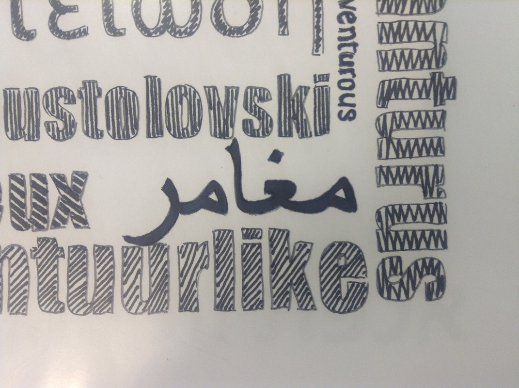
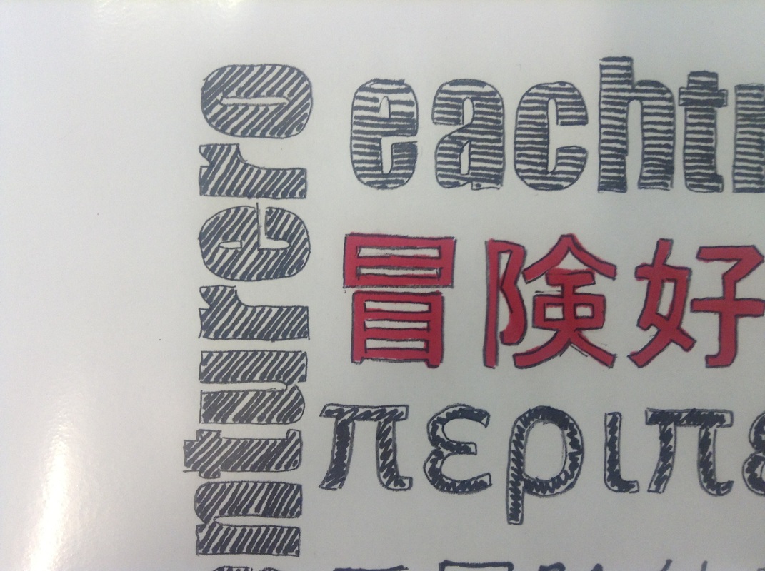
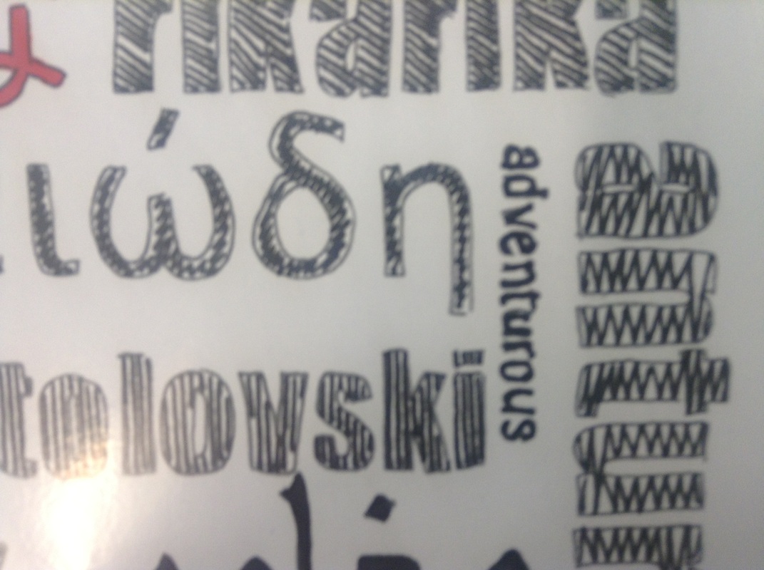
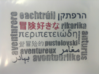
I chose to represent three of my friends using an adjective from their native language (or one they use frequently on Facebook) and combining this with the same word translated into a range of different languages. There is also a small English translation included - the specific language is in red, then the other words are filled in black. There are some close-ups below to show this.
The piece was created using a power-point slide with the text using the Impact font, which I think traced in pencil to create a series of outlines. This helped to create a hand lettered effect, and is a similar technique to that used by Fiodor Sumkin. I then used a red Pro-marker to fill in the key word, and a black fine liner to add texture to the other words. Words in non-Latin fonts were filled in plain black to emphasise the different alphabets.
The pieces were inspired by the song "La Palabras de Amor" and the fact that several of the posts on my Facebook feed appear in different languages. I also find the derivation of words and the evolution of different languages very interesting, especially the relationship between different languages. Having studied Latin at school, I have found it much more useful than the French I learned when I am travelling, as both Spanish and Italian are derived from Latin.
I chose to represent three of my friends using an adjective from their native language (or one they use frequently on Facebook) and combining this with the same word translated into a range of different languages. There is also a small English translation included - the specific language is in red, then the other words are filled in black. There are some close-ups below to show this.
The piece was created using a power-point slide with the text using the Impact font, which I think traced in pencil to create a series of outlines. This helped to create a hand lettered effect, and is a similar technique to that used by Fiodor Sumkin. I then used a red Pro-marker to fill in the key word, and a black fine liner to add texture to the other words. Words in non-Latin fonts were filled in plain black to emphasise the different alphabets.